Domino, Oct. 7, 2022
Even on Gloomy Days, a U-Shaped Kitchen Promises Good Views in This Portland Home
Same goes for the strategically placed sofa.
Published Oct 7, 2022 1:45 AM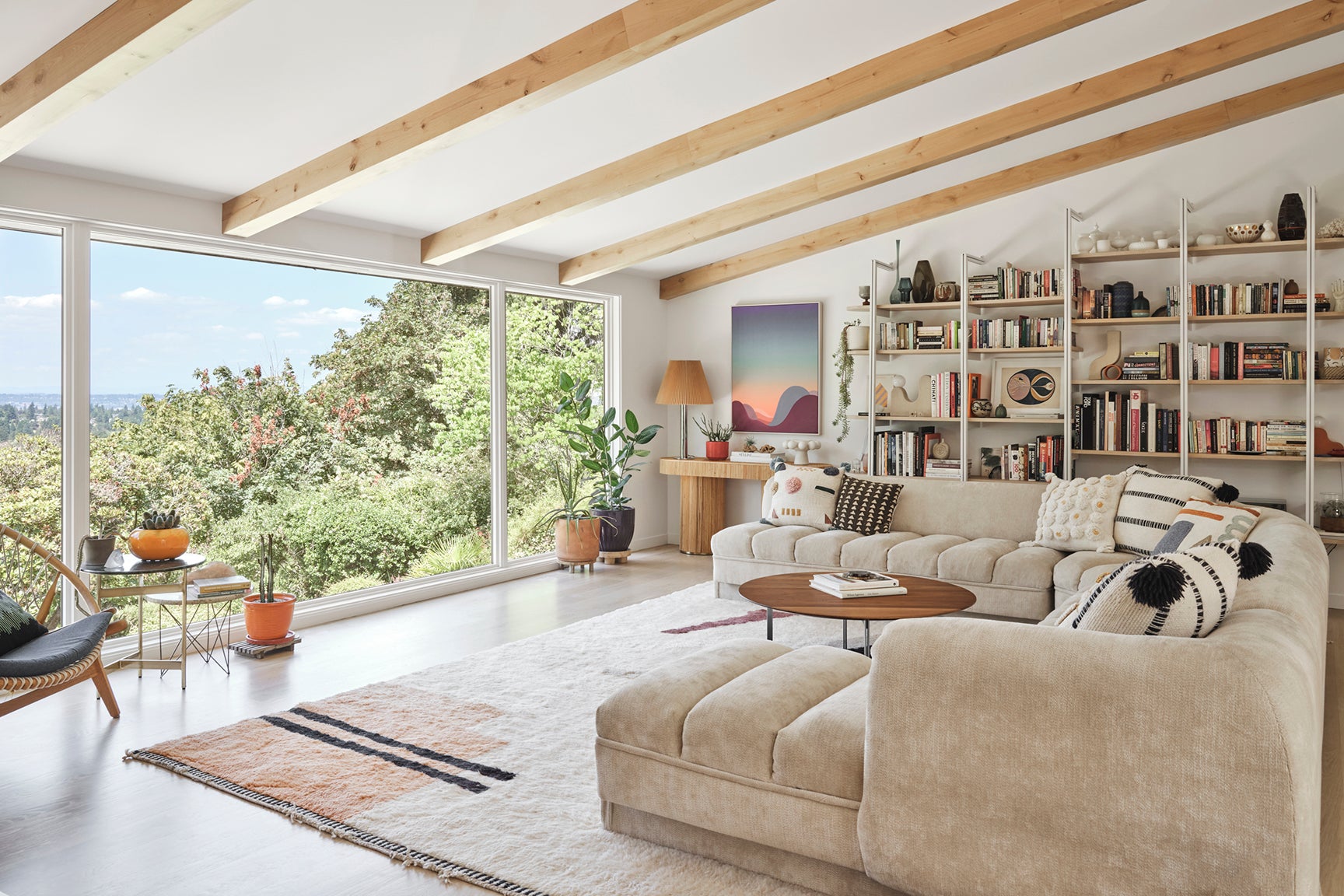
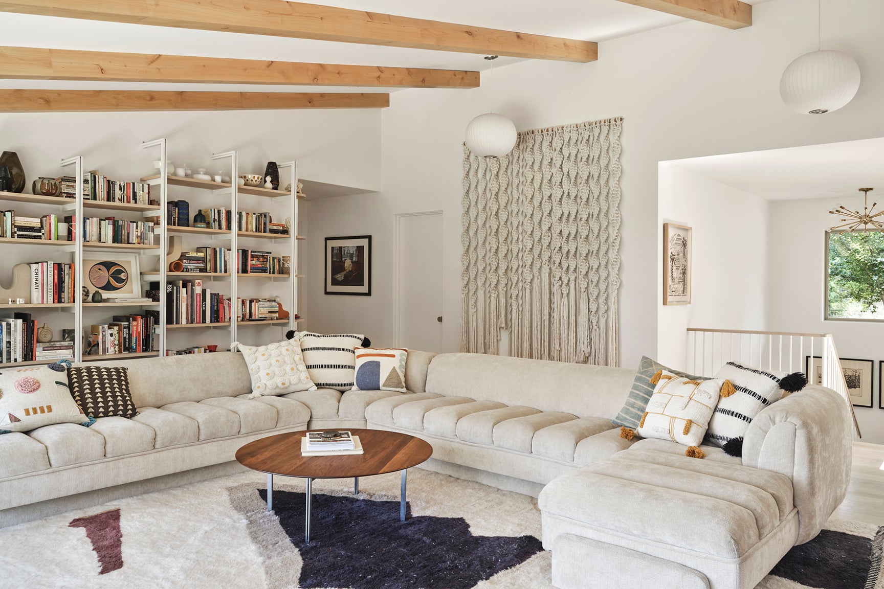
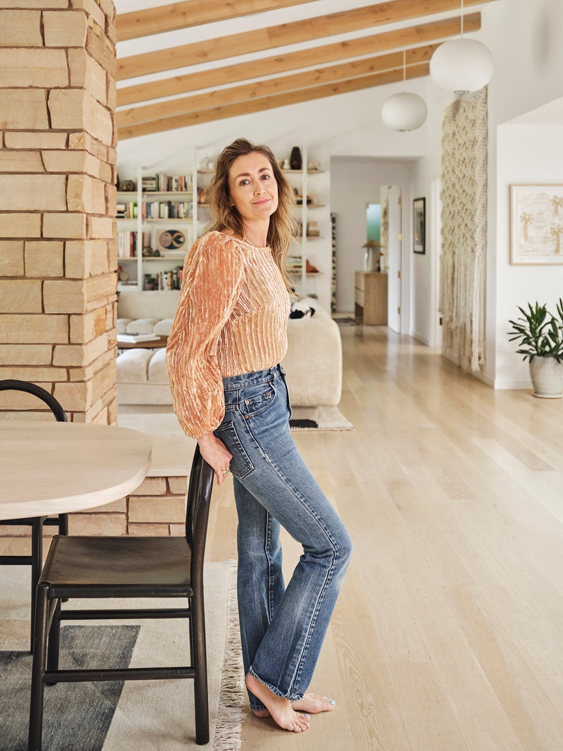
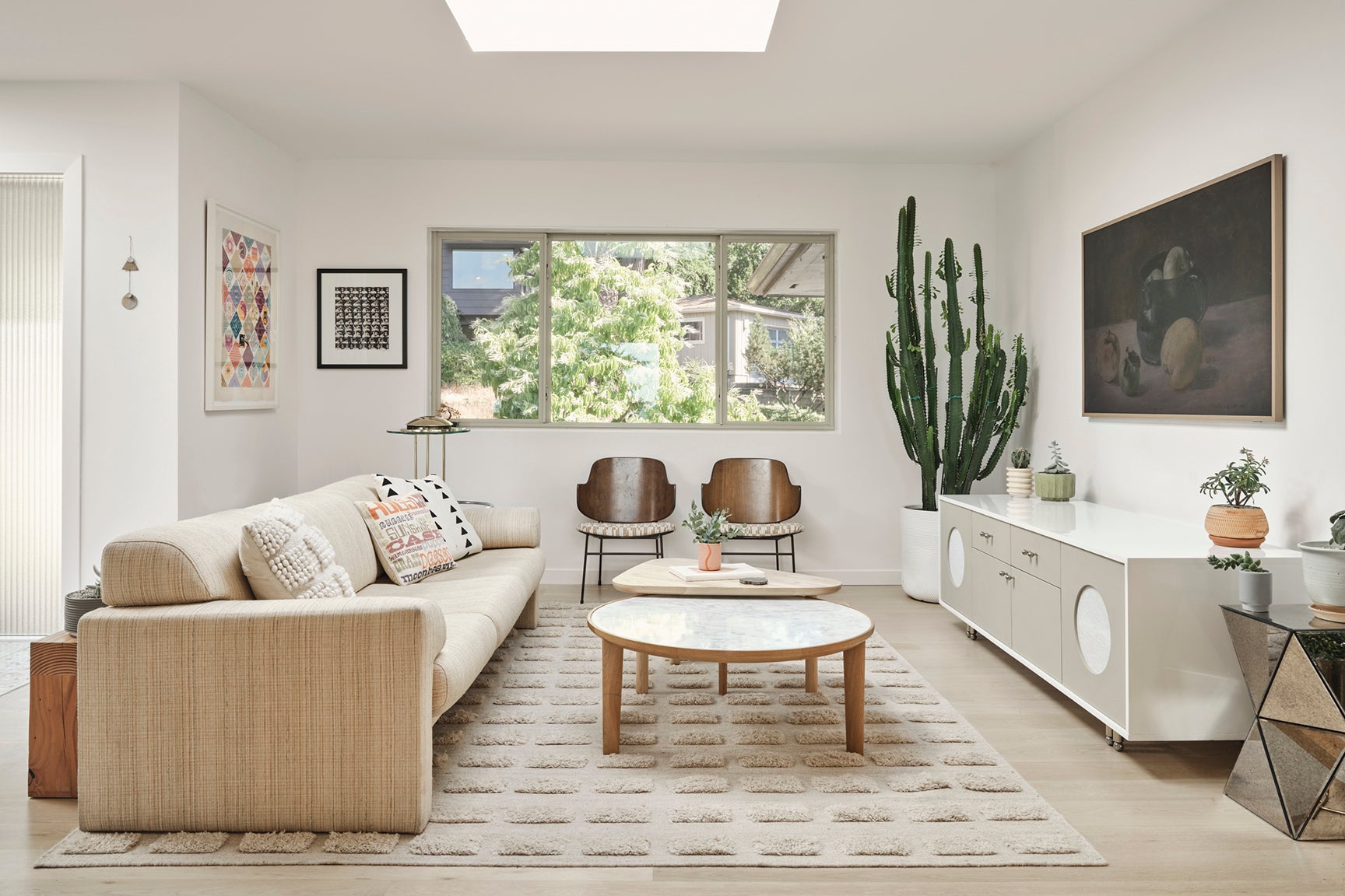
For some, a body of water or a soaring mountain range makes for a good view. For interior designer Jessica Hansen, it was simply the ability to look out into the distance that sold her on her hillside Oregon home back in 2018. “The Portland fog can feel so claustrophobic, so being able to see out really helped,” says Hansen, the founder of Tandem Design. Naturally, once her Vladimir Kagan sofa finally arrived (she bought the vintage piece from a seller in Florida who was kind enough to stow it in a storage unit for a year as her renovations took place), there was only one spot to put it: smack-dab in front of the extra-long window overlooking the backyard.
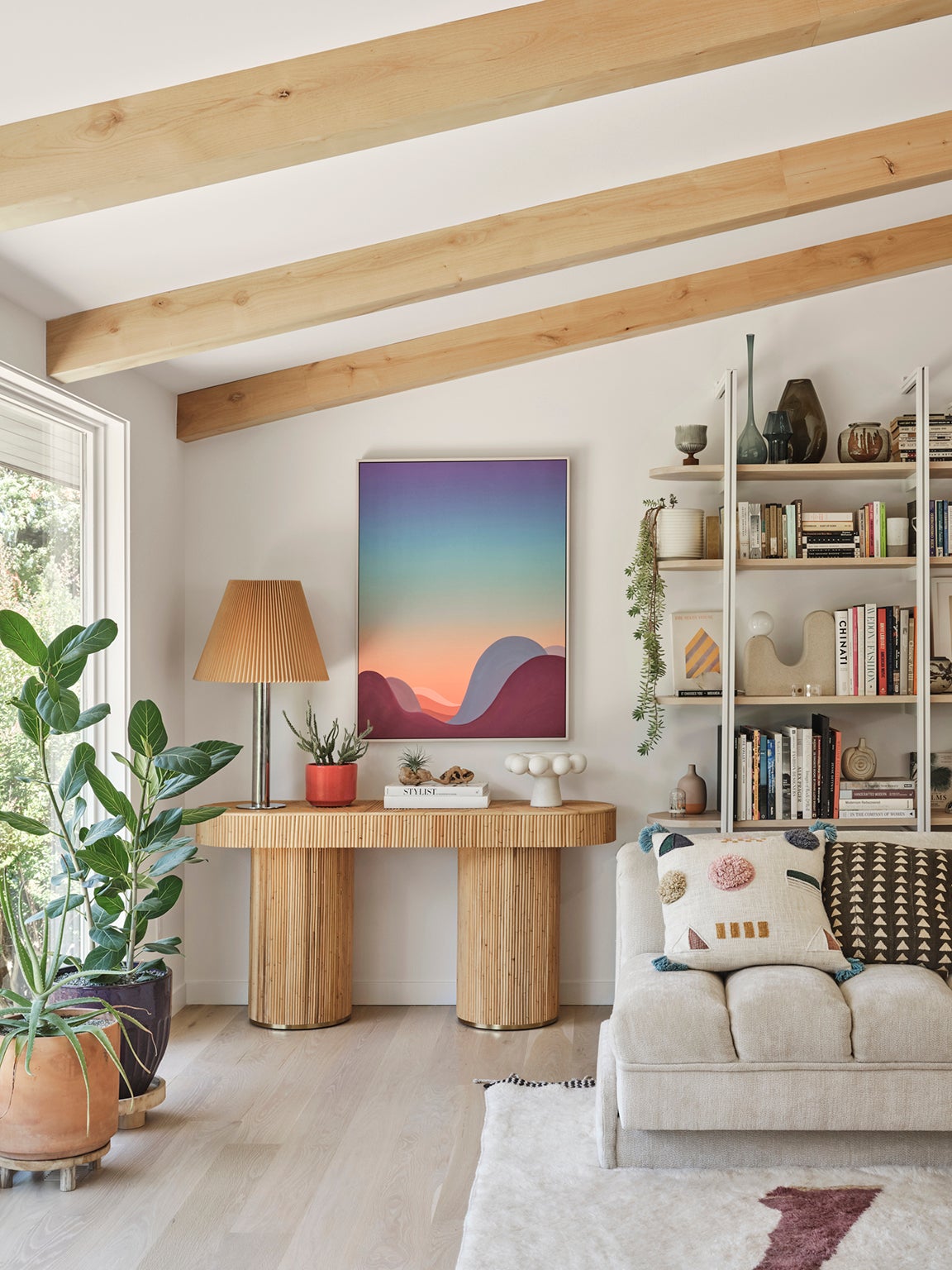
The U-shaped sectional is unsurprisingly the center of life in Hansen’s house: It’s where she entertains friends and where her two sons, Walter (9) and Otis (7), curl up with a book after school. “I don’t know what the original upholstery is, but I’ve gotten mud out of it, blood out of it, dog pee…” she says with a laugh.
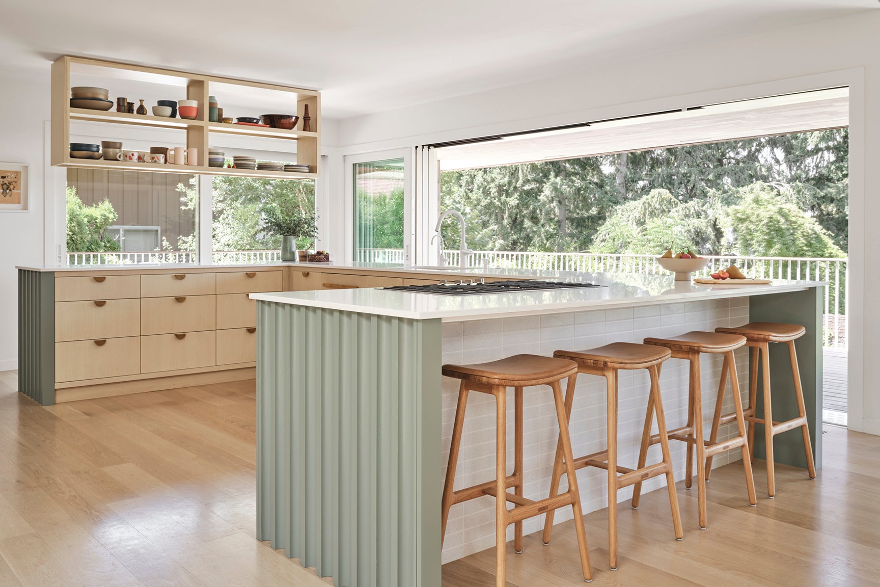
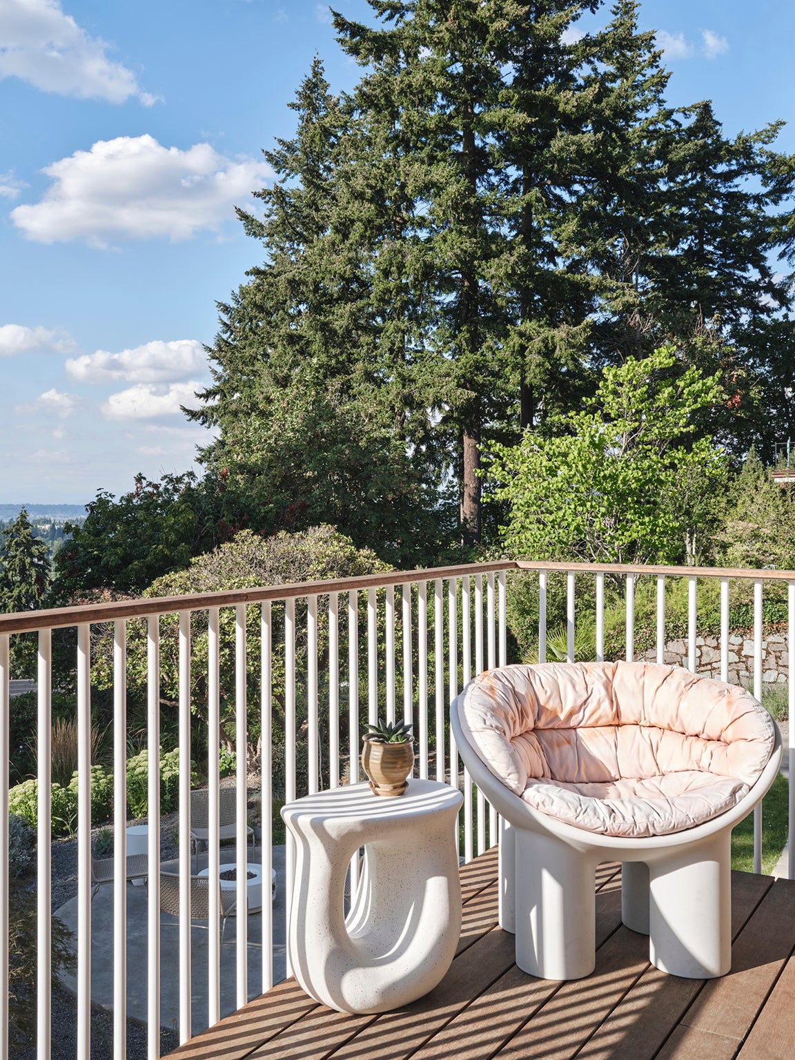
Because the circa-1961 house is perched on a slope, it looks small and unassuming from the street, when in reality it spans 3,548 square feet. It took a few major structural updates to get the interior looking as spacious as that, though. “The house was actually very dark. It had lots of rooms,” she recalls. Hansen took down a wall that originally divided the living and dining spaces and extended the pitched ceiling. Where there was once just a window over the kitchen sink, there is now a series of five sliding door panels (the designer stole part of the nearby garage to give herself enough wiggle room for the indoor-outdoor feature). The arrangement allows for ultimate flexibility: Hansen can crack open just one or unfurl them all. The Faye Toogood seating on the adjacent deck features custom tie-dyed cushions, courtesy of Hansen’s intern, Addie.
ADVERTISEMENT
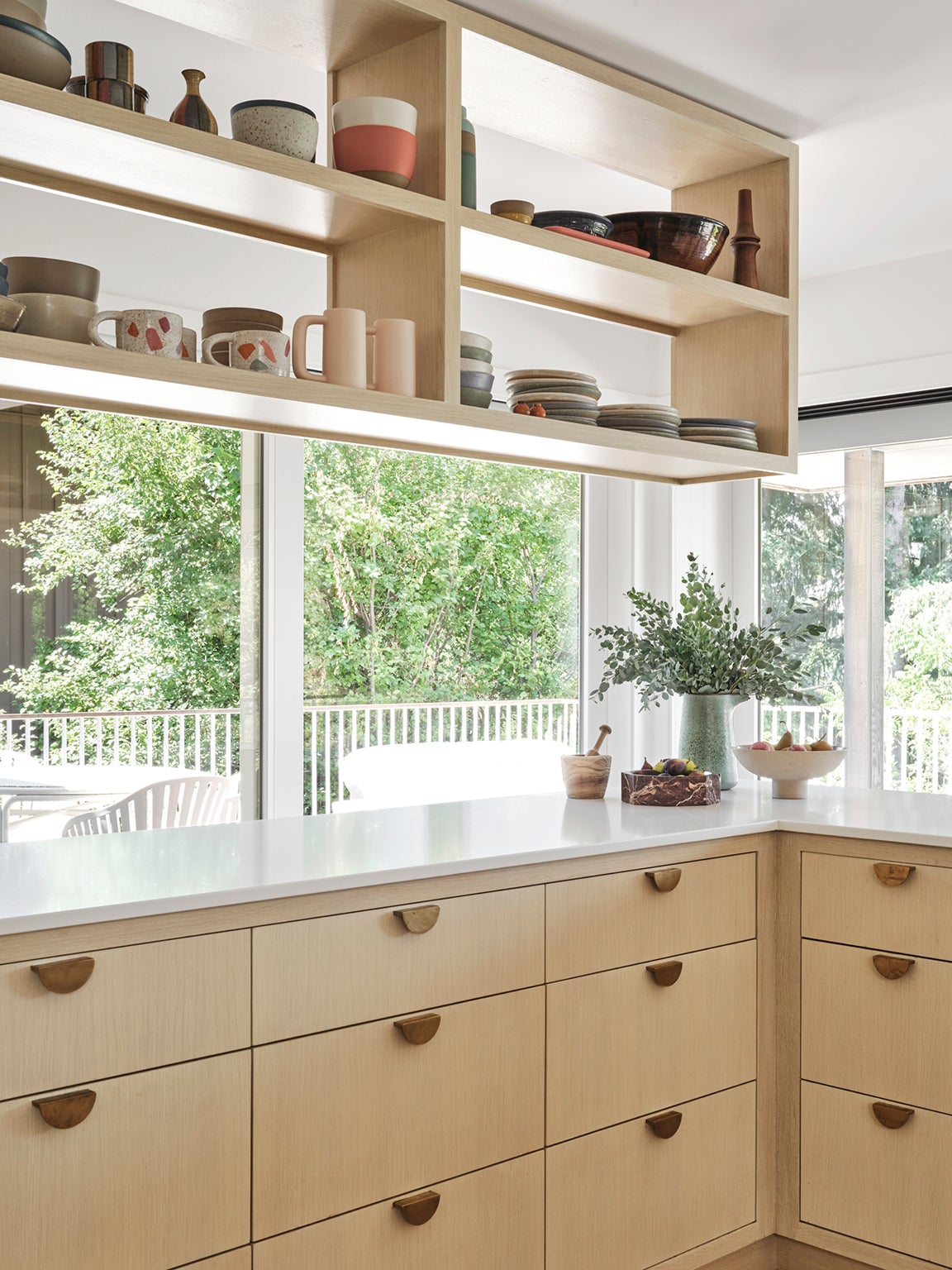
Not sticking an island in the middle of the kitchen or uprooting the floor plan was a decision made with—what else?—the views in mind. “Every way you face, you’re either looking outside or you’re looking into the rest of the house,” Hansen points out. To maximize the cupboard layout, she had her cabinetmaker add six drawers to the corners (though you can barely tell they’re there because they blend in with the fluted paneling). “There was just dead space, so I wanted to use it for the things we don’t need very often. One of them is my junk drawer,” says the designer. Other additions she swears by: a hidden pull-out trash can, a wine refrigerator, and tall upper cabinet doors that hide her small appliances.
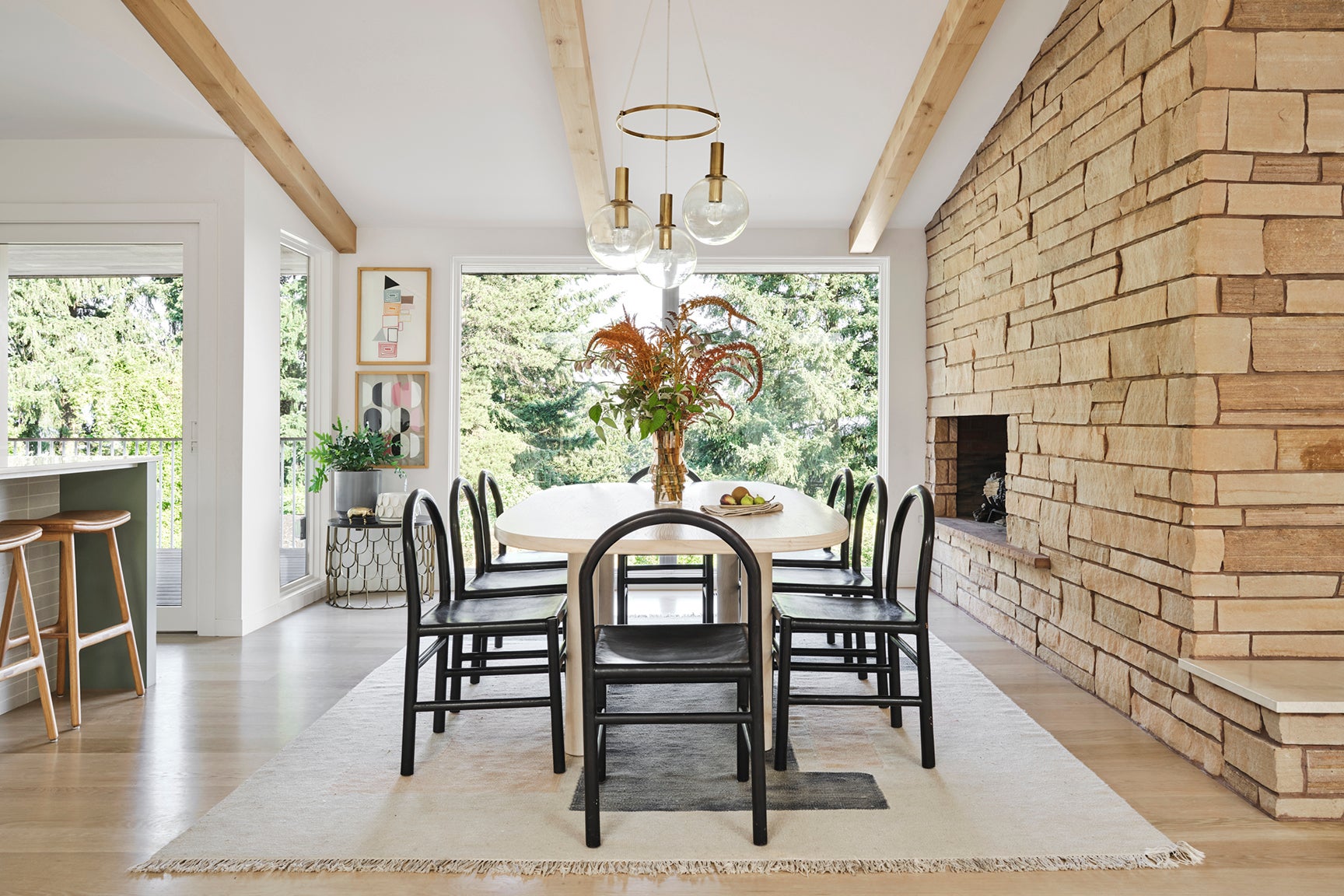
Previously, one half of the massive fireplace that bisects the living and dining areas was covered in thin bricks. Hansen decided to wrap it fully in stone like the other side, but finding a match to the ones that had been unearthed more than 50 years ago proved to be a challenge. “The masonry person was like, ‘This is never going to happen; you should just pick a new material,’” she recalls. But in a quarry in Colorado, she discovered an option that looked similar enough—she could pull this off. In order to make the whole thing appear authentic, Hansen took bits of stone from the original side and sprinkled them on the new wall.
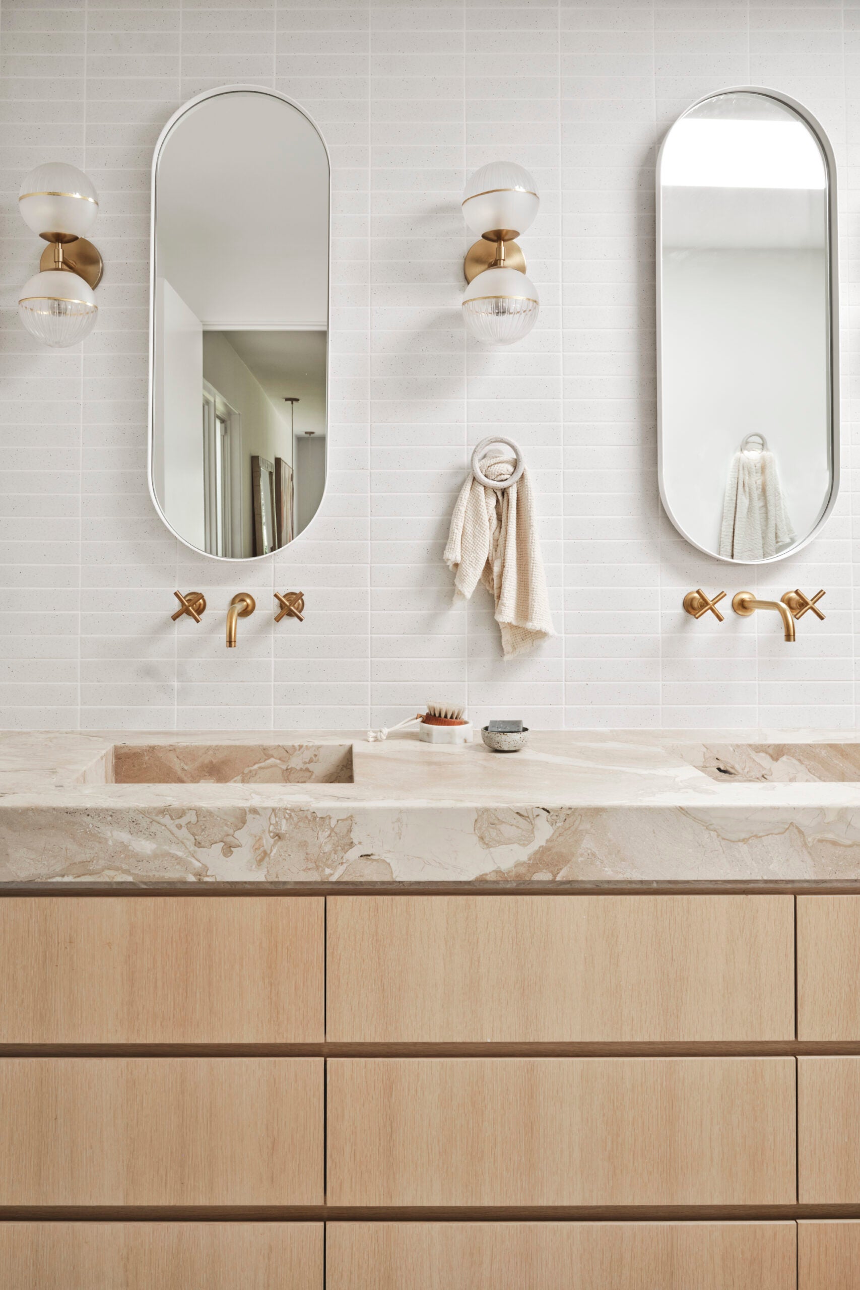
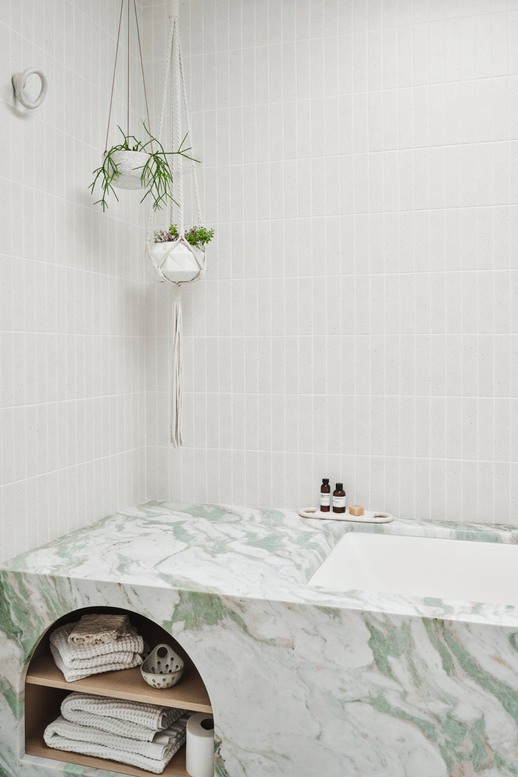
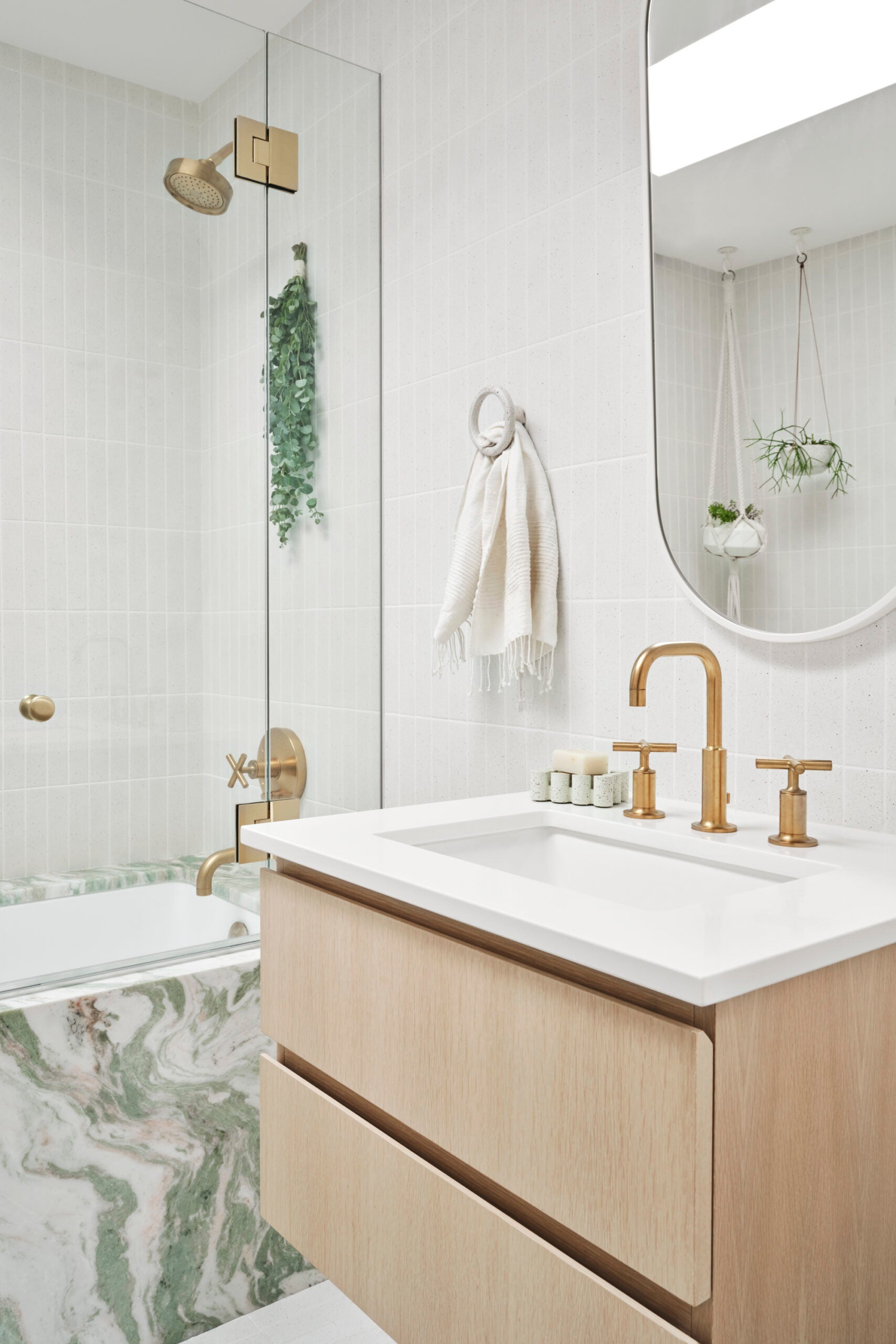
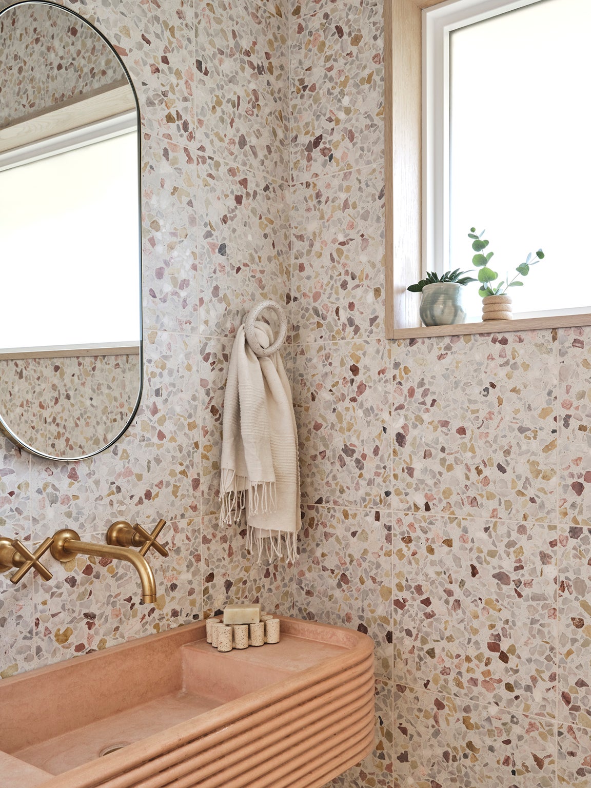
The designer was met with no’s once again when she began scouring her local stone yards for slabs of colorful marble, but her persistence led her to uncover a blush option for her primary bathroom vanity (the piece was a remnant from a hotel project 10 years ago). When Hansen discovered a slab of pink and green marble for her guest bathroom in the depths of another yard, the shop let her take it home for a mere $600. “They were so excited to see somebody buy it,” shares the designer. Despite his nerves, Hansen’s fabricator was able to seamlessly cut it into two solid pieces, making delicate holes for the tub and the arched shelving nook.
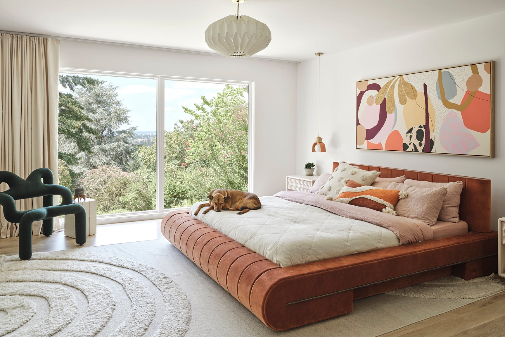
It took quite a few more tries to get Hansen’s bed right. When she first ordered the custom piece from a design firm she has long admired, it arrived smaller than expected. She had to wait for the company to sell the queen-size version to a new buyer before building her a king from scratch once more. But when that one arrived, she noticed the headboard had been damaged in shipping—and the replacement part didn’t align with her current bed-frame system. Thankfully, the brand swiftly solved the problem by hiring a local furniture maker to come out and tweak it. “It was worth the wait,” says Hansen. “It’s so sturdy. The dog and my kids are all on it. It’s held up great.”
ADVERTISEMENT
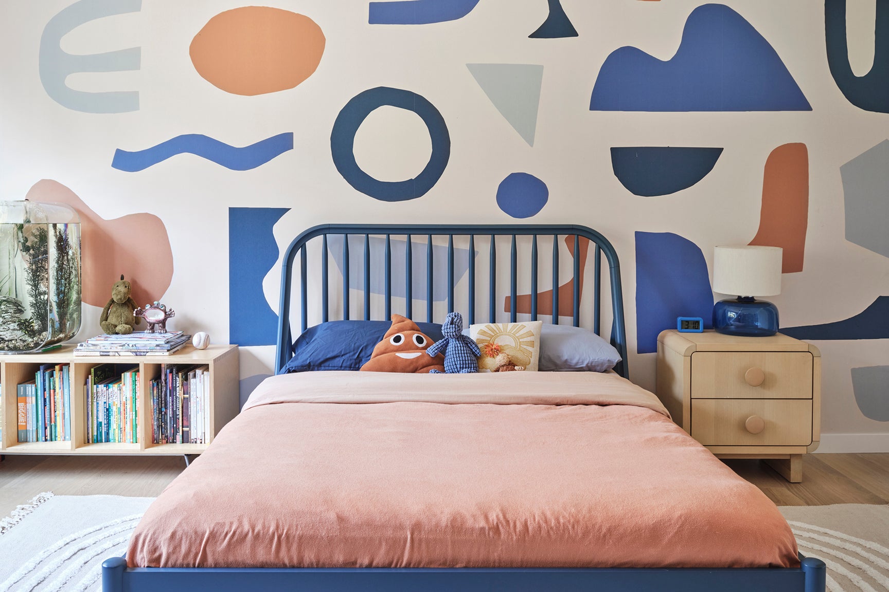
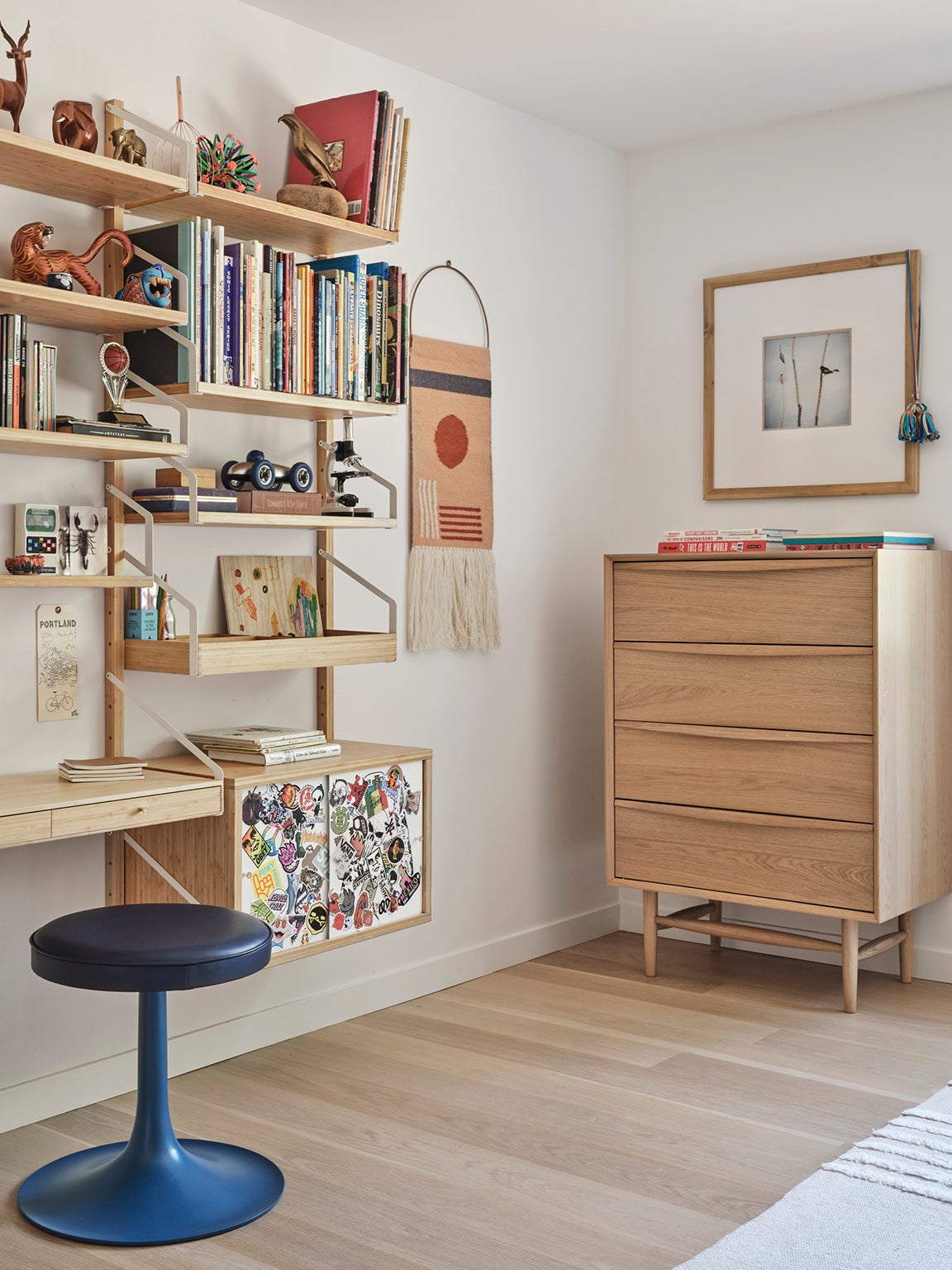
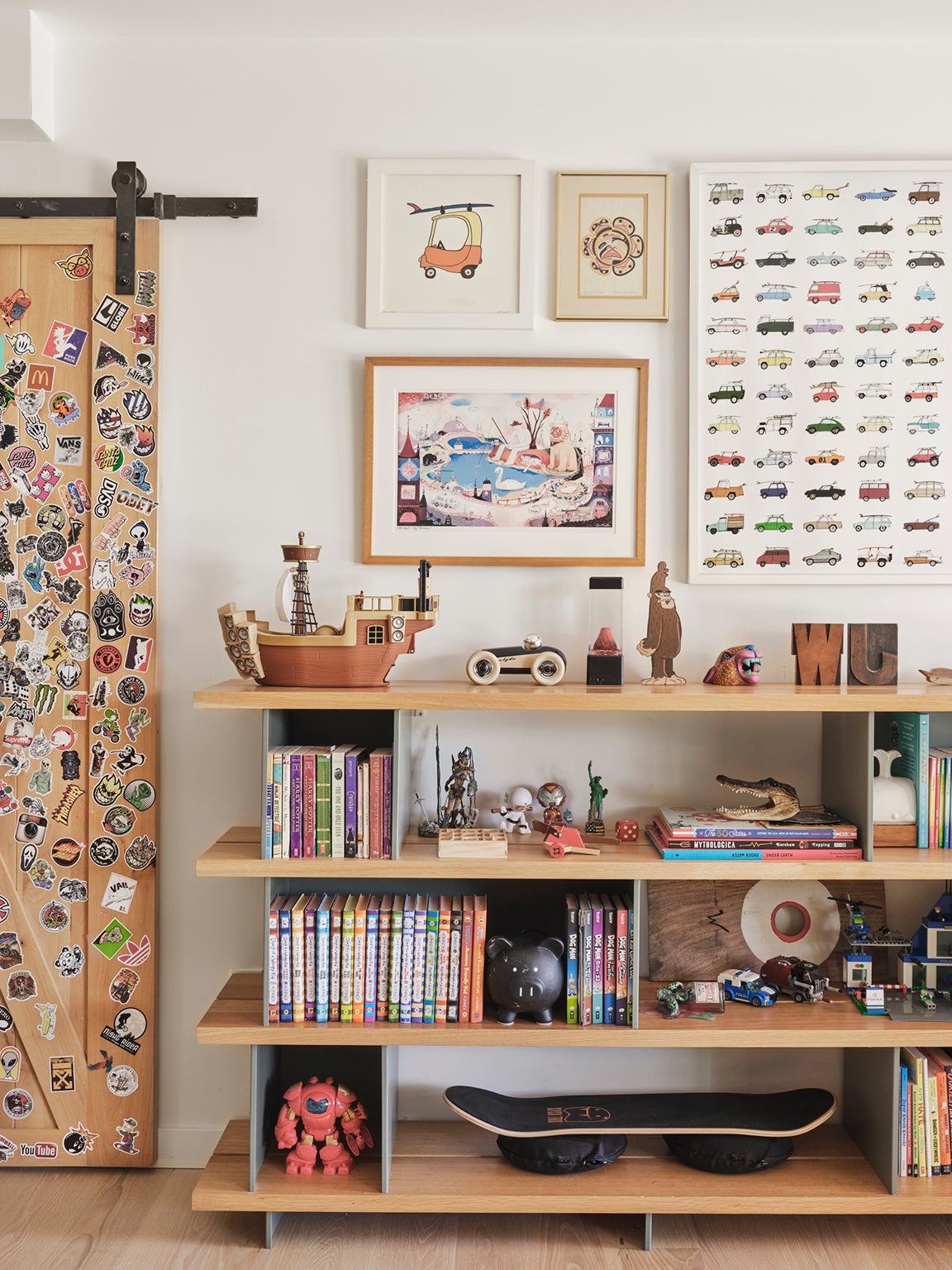
Hansen’s boys have begun to tap into their own creativity, too. The designer wasn’t a fan of the barn door in Walter’s bedroom (it came with the house), but her 9-year-old was adamant about keeping it so he could treat it like a canvas. “We love stickers!” she jokes. Otis prefers to apply his collection to his wall-mounted IKEA desk. “Of course, what big brother is into, little brother is into,” adds Hansen.
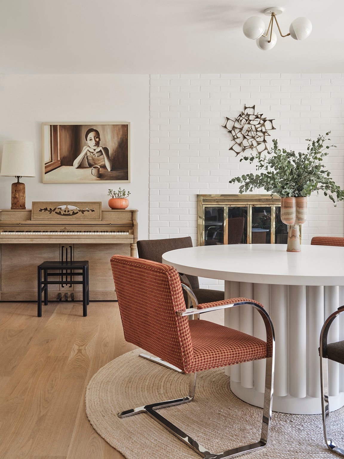
The designer introduced a part of her own youth to the home in the basement: Above the piano is a self-portrait she painted when she was 20. “I had given it to my mom because I didn’t think I wanted it anymore, but recently I was like, you know what, I want that back,” she shares. It’s all about perspective.
