Domino, Oct. 29, 2022
Paint Indecision Plagued This Couple’s No-Demo Reno—Until They Found This Color Palette
Because the “Home Depot orange” wainscoting had to go.
Published Oct 29, 2022 1:13 AM
We may earn revenue from the products available on this page and participate in affiliate programs.
Anyone who has ever stared too long at paint chips at the hardware store can tell you the cold, hard truth: picking the just-right tones for your home sometimes takes a village—or at least some trial and error.
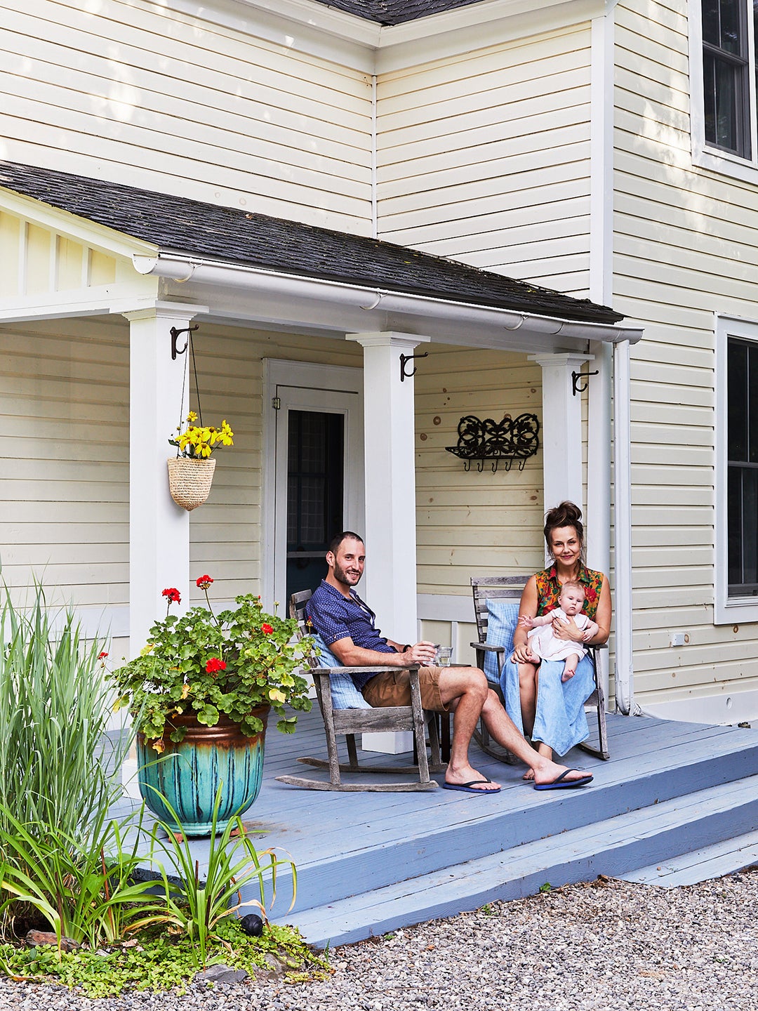
But in February 2020, when magazine editor Elizabeth Kiefer and her husband, Andrew Tejerina, bought their 1901 cottage in Tivoli, New York, they knew one thing: The “Home Depot orange” wainscoting, as she calls it, had to go.
“In another house, I could be more eclectic, but because the space is as small as it is, it needed a streamlined look,” Kiefer says of the two-bedroom, nearly 1,100-square-foot home they bought from a college professor. That said, a beige-on-beige stark scheme was out of the question, too. “I’m really happy to see design becoming more fun and injected with personality again,” she says. “There’s a tendency to kind of mistake minimalism for style. But you have to be able to work with other things—otherwise how do you live in it?”
ADVERTISEMENT
And so achieving a layered, traditional look started at the paint store, where they discovered a decision-making method that would help tell their home’s story. The couple mostly (if not only) choose paints from Benjamin Moore’s Williamsburg collection, a predetermined, always-goes-together range of shades that guided them in the right direction. “I knew I wanted softness, and the historical palette just made sense for us,” Kiefer says.
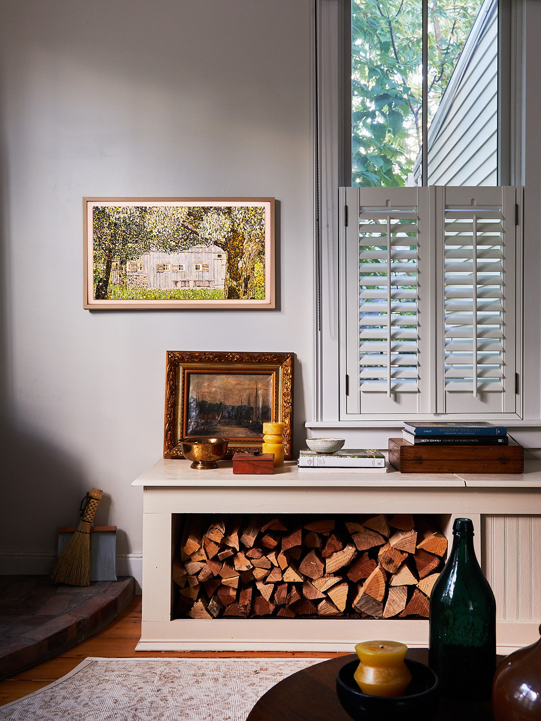
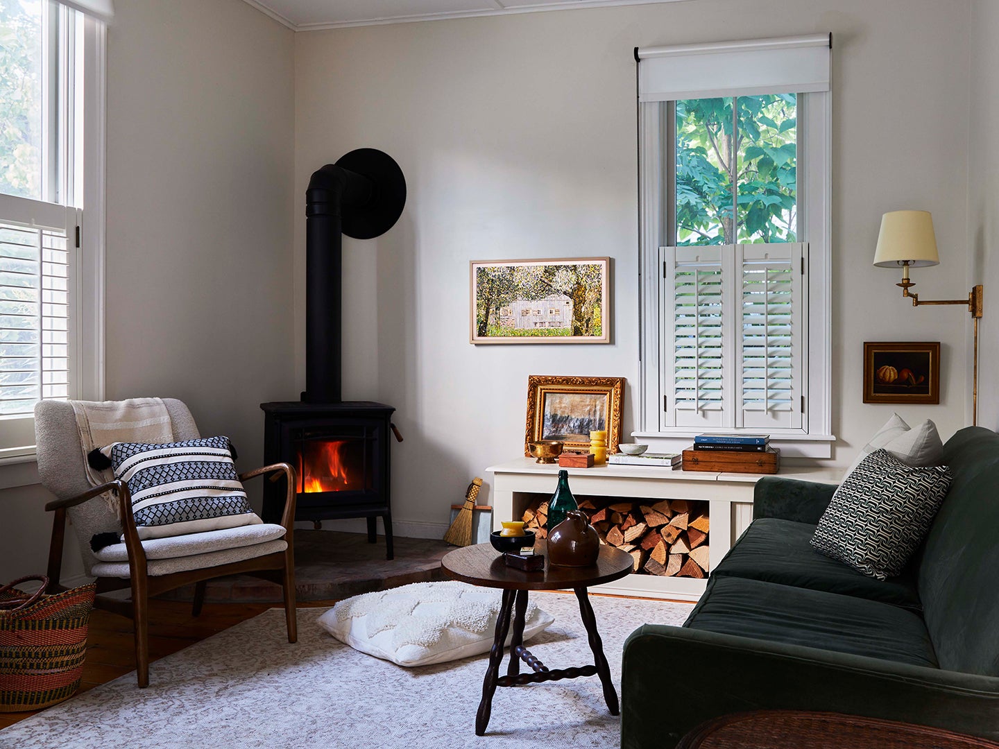
In the living room, where they coated the walls in Harwood Putty (“I would bathe in this,” Kiefer says), they also added a wood-burning stove for peak upstate coziness. Their chair and sofa, a green velvet number, were floor samples (no supply chain delays here) that they found at the nearby Hammertown Barn, and the rest is vintage. (Except for their Samsung Frame TV, which blends in among other art they’ve collected over the years.)
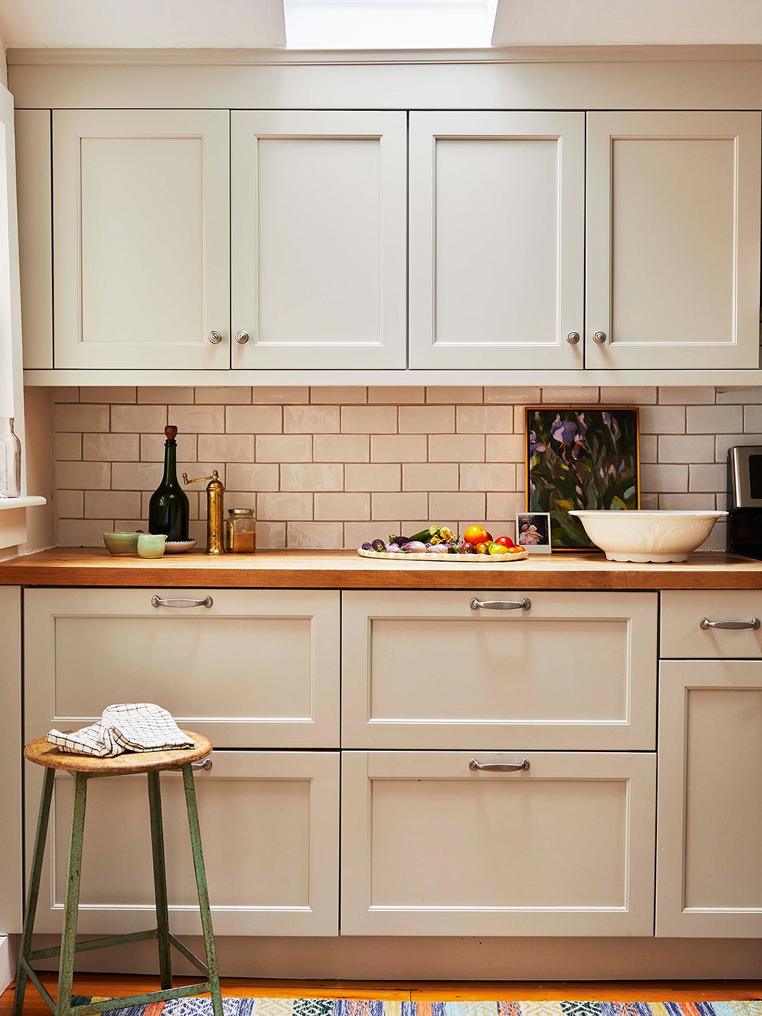
That’s not to say that, even with a range of colors in hand, they didn’t encounter any mistakes along the way. In the kitchen, they chose a color called Tranquil Blue to cover up dated avocado cabinets, but just one coat in, they quickly realized the shade was not living up to its calming name. They swerved and ended up with a greige color. No regrets, though. “You have to give yourself the generosity to experiment and see if something works,” she says. “And if it doesn’t, you’re only out a paint sample.”
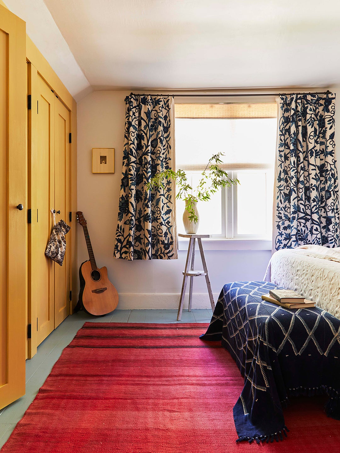
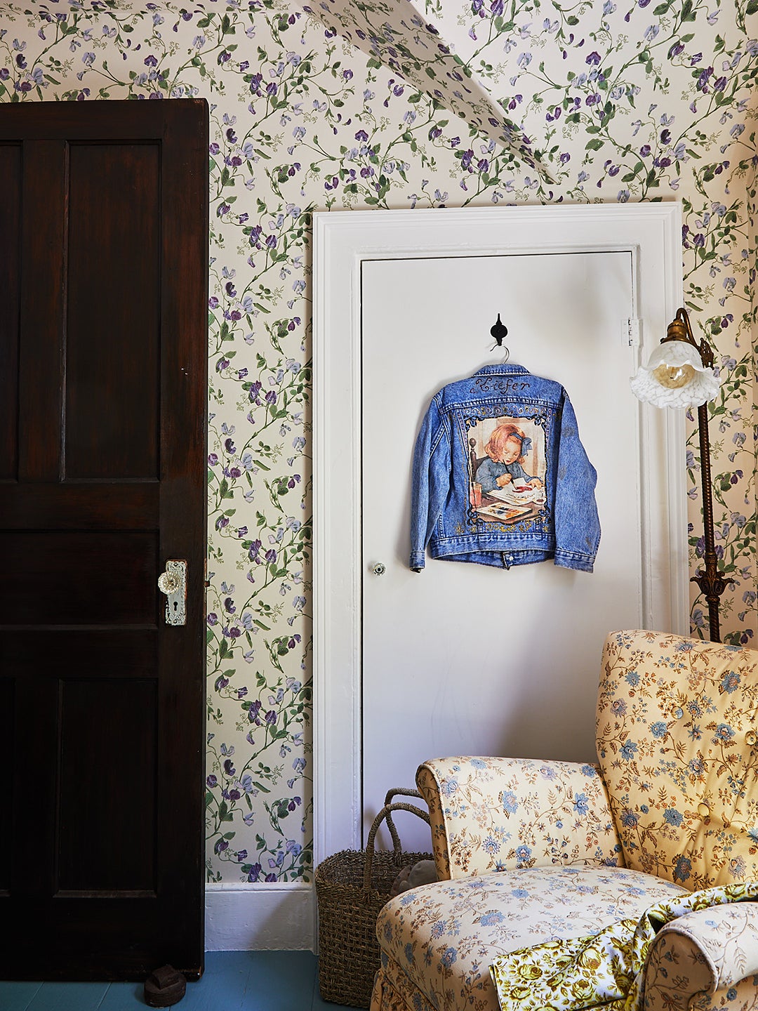
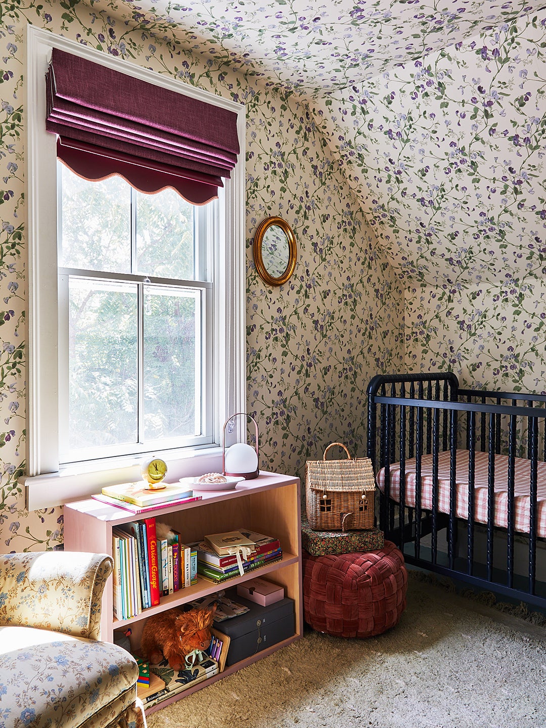
For trickier design quandaries, they had Kiefer’s best friend, Leah Ring of Another Human, on speed dial. “She’s always very good at encouraging me to experiment a little bit,” Kiefer says. For example, in their daughter Violet’s room, the couple chose a Cole & Son wallpaper pattern featuring her namesake flower. And in the primary bedroom, a sunny shade on the closet doors contrasts with a vivid pinky red rug and blue floors.
ADVERTISEMENT
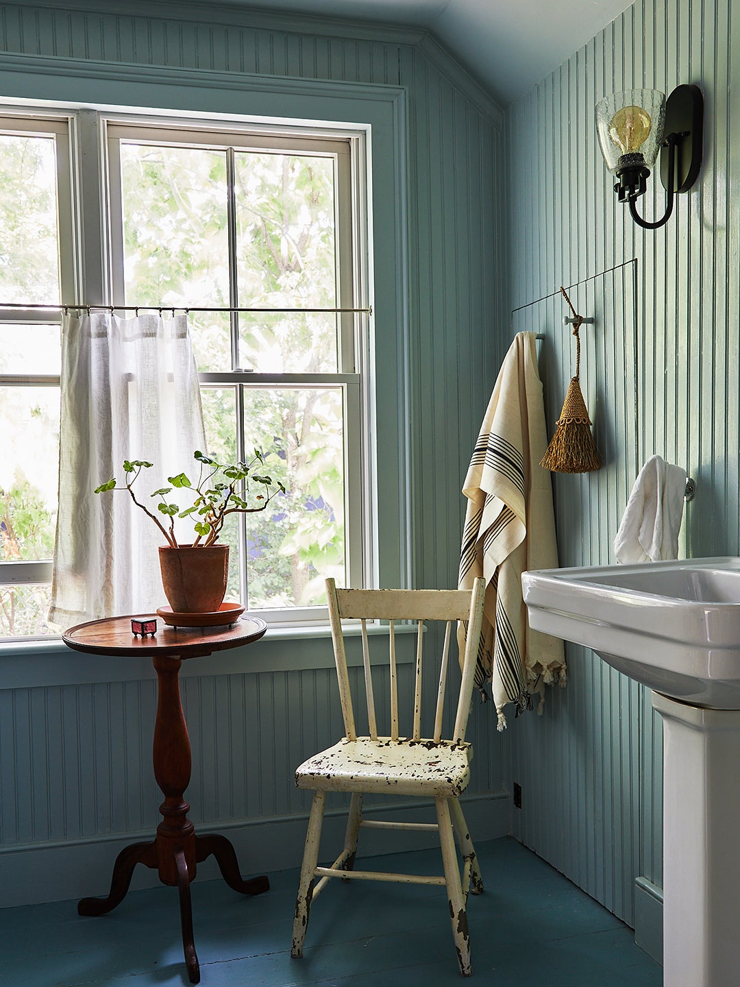
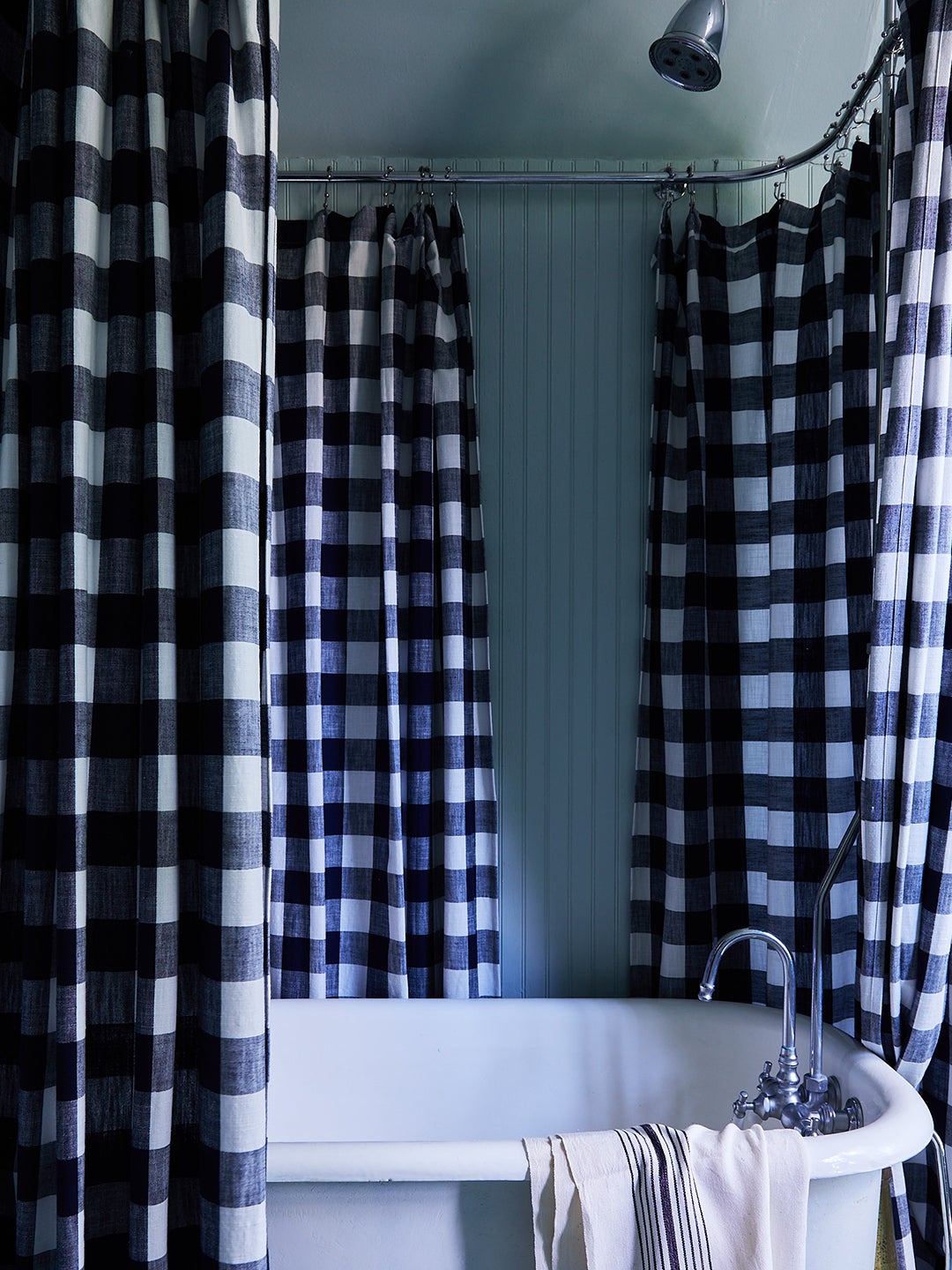
And when they were totally stumped, they painted an area white before choosing a hue. “Sometimes, only when a room is a clean slate can you start to project what possibilities are available,” Kiefer says. Eventually, the white parts (aka the upstairs bathroom and hardwood floors) became a soothing blue.
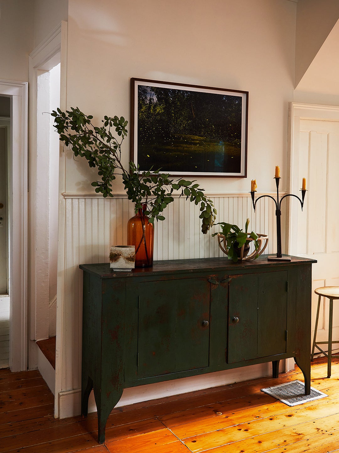
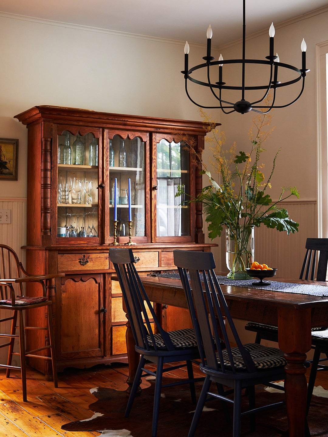
Paint colors aside, they didn’t stress too much over finding furniture, either picking things out from roadside estate sales (like her $50 desk, which she painted black) or at the Antiques Warehouse Hudson, where they snagged the hutch that now lives in the dining room.
Together, it all works, and for them, it’s the ideal mix of cool and unfussy, without teetering too far into cottagecore. It won’t be their forever home (size-wise it might not work as Violet gets older), but for now, “it’s been a perfect little project,” Kiefer says. “And what we’ve learned by being here is that we’ve found our village, in a figurative and actual sense.”
